U.S. Inflation by Decade: Why the 2010s Were the Historical Exception
Everyone was caught off-guard by the 2021–2022 inflation surge. But here is what the data actually shows: the real surprise was not that inflation returned — it was how extraordinarily calm the 2010s had been.
At 1.75% per year, the 2010s rank as the lowest non-deflationary decade since U.S. records began in 1913. If your mental model of “normal inflation” was shaped by that decade, you were not seeing the baseline. You were seeing an outlier. The surge that followed was, in historical terms, a correction back toward a very long average.
The Data: A Century of U.S. Inflation, Decade by Decade
The figures below are U.S. average annual CPI inflation rates (geometric means) compiled from BLS data and published by InflationData.com. The 2020s bar covers 2020–2025 only and should be treated as partial.
| Decade | Avg. annual CPI | Note |
|---|---|---|
| 1920s | 0.38% | Near-zero; postwar deflation offset by late-decade growth |
| 1930s | −1.80% | The only deflationary decade on record — Great Depression |
| 1940s | 4.86% | WWII spending surge and postwar price adjustment |
| 1950s | 1.82% | Relative calm after the wartime shock |
| 1960s | 2.45% | Steady growth; Vietnam-era spending picks up late |
| 1970s | 7.25% | Highest on record — oil shocks, loose monetary policy |
| 1980s | 5.82% | Still elevated; Fed tightening gradually takes effect |
| 1990s | 3.08% | Returns to moderate range |
| 2000s | 2.54% | Broadly moderate; energy price spikes mid-decade |
| 2010s | 1.75% | Lowest non-deflationary decade — the historical anomaly |
| 2020s* | 4.20% | *Partial: 2020–2025 only |
Long-run geometric mean, 1913–present: 3.15% per year.
One footnote worth adding: the 1910s (specifically 1913–1919) averaged roughly 9.8% per year — the highest of any era in the modern record — but that figure was entirely WWI-driven and is excluded from the decade chart above.
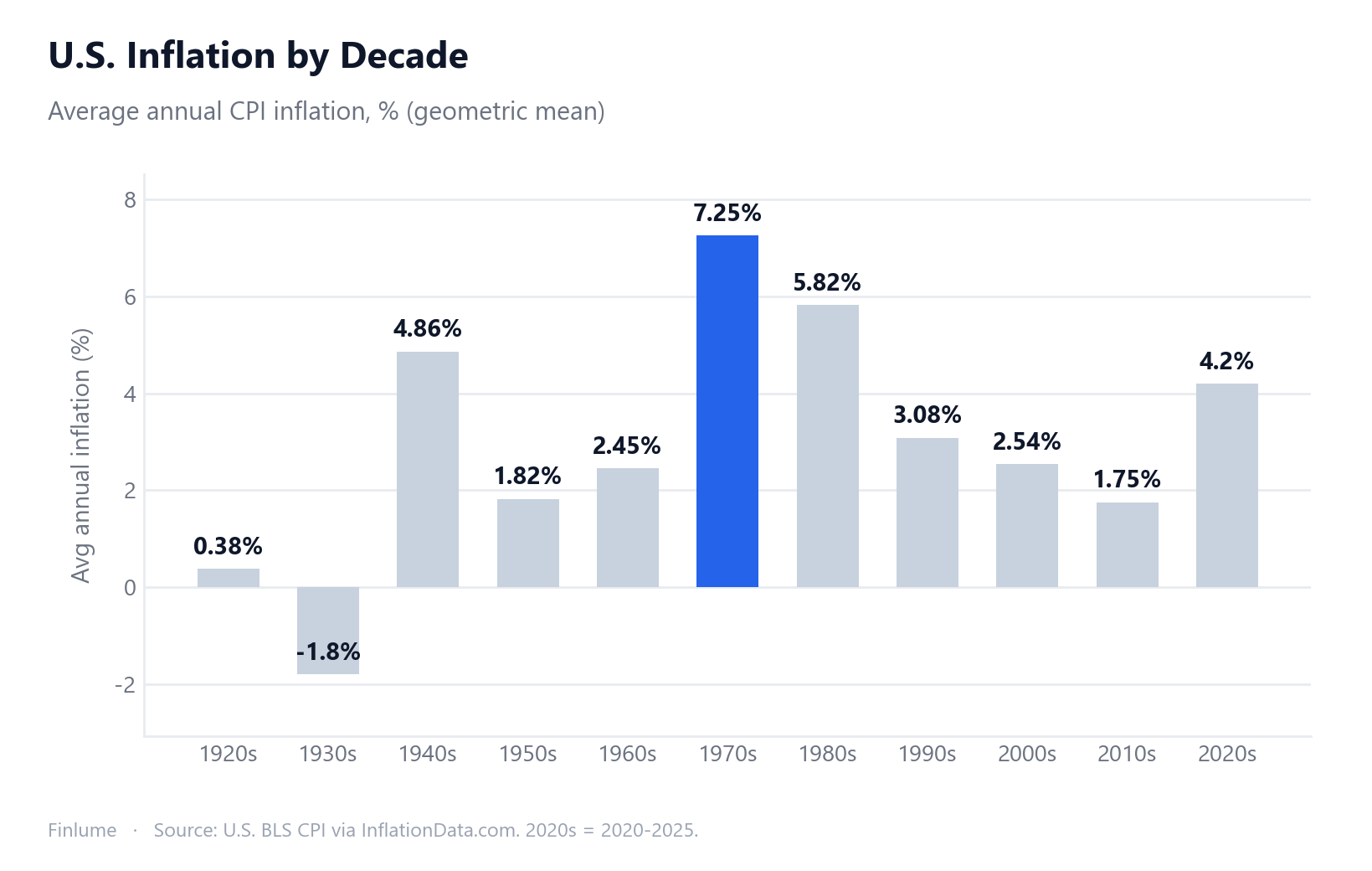
The 2010s Were the Anomaly, Not the Template
Run your eye down the table and look for outliers. Two stand out immediately. The first is obvious: the 1970s at 7.25%, the decade of oil shocks and stagflation. The second is subtler: the 2010s at 1.75%, sitting well below every other peacetime decade in the record.
The long-run geometric mean is 3.15% per year. The 2010s came in at barely more than half that. Only the deflationary 1930s (depression-driven) and the near-zero 1920s were lower — and both had extraordinary explanations. The 2010s had no such shock. They were just unusually calm. That calm shaped the expectations of an entire generation of investors and savers.
I have tracked market and economic data long enough to notice that each decade tends to produce a cohort calibrated to its own conditions. People who formed their inflation intuitions in the 2010s were, without realizing it, calibrated to a historical exception. When inflation returned to 4%+ territory in 2021, headlines called it a shock. The century-long record frames it differently: it looked a lot like a return to the mean.
Purchasing-Power Loss: Three Key Scenarios
The decade table tells you how high inflation was. This table shows what that actually did to money sitting idle — the same dollars, earning nothing, just held. All three figures use the formula (1+r)^t applied to BLS CPI rates from InflationData.com.
| Scenario | Annual rate | Horizon | Price multiplier | Purchasing power lost |
|---|---|---|---|---|
| 1970s (peak inflation decade) | 7.25% | 10 years | ×2.02 | ~50% |
| 2010s (calmest decade) | 1.75% | 10 years | ×1.19 | ~16% |
| Long-run average (1913–present) | 3.15% | 30 years | ×2.53 | ~60% |
Assumption: cash earns zero real return — no investment, no interest income above inflation. “Purchasing power lost” = 1 − (1 ÷ price multiplier), rounded.
The gap between the 1970s and 2010s rows is striking: a 5.5 percentage-point difference in annual rates compounds over ten years into 50% vs. 16% lost. Same money, same strategy of holding cash. Different decade, completely different outcome. This is precisely why a half-point difference in inflation rarely feels urgent in any given year but accumulates into something that genuinely matters.
The ~3% Convergence Across Currencies and Regimes
Here is a pattern I find genuinely useful for framing long-term planning, regardless of which country you live in:
- United States (1913–present): long-run geometric mean 3.15%/yr (BLS CPI via InflationData.com)
- Germany (1960–2025): long-run average 2.8%/yr (WorldData.info)
- Japan (1960–2025): long-run average 3.0%/yr (WorldData.info)
Three different currencies. Three different central bank regimes. Germany went through hyperinflation in the early 1920s. Japan navigated a prolonged deflationary stretch in the 1990s–2000s. The U.S. rode the 1970s oil shocks and then the 2008 financial crisis. Yet all three converge in the 2.8–3.2% band over the long run.
The lesson is not that inflation is always exactly 3%. It is that across different economies and currency regimes, moderate positive inflation is the persistent long-run tendency — and idle cash loses real value in all of them. The inflation calculator lets you apply any rate to your own numbers.
What 30 Years at 3.15% Actually Does to Cash
The decade-by-decade table is illuminating, but the figure that matters most for planning purposes is the long-run average applied across an entire working lifetime.
At 3.15%/yr for 30 years: prices roughly 2.53× — that is, 1.0315^30 ≈ 2.53. A sum of cash left completely idle, earning nothing above inflation, loses approximately 60% of its purchasing power over those three decades.
To frame it concretely: $10,000 held in a zero-yield account today has the purchasing power of roughly $4,000 in 30 years, if the long-run average holds. That is not a forecast — it is what the historical average implies, stated explicitly as an assumption. The practical implication: beating inflation is not an ambitious target. It is the baseline requirement for not slowly falling behind. For a deeper look at the mechanics, see how inflation erodes savings.
Key Takeaways
- U.S. CPI has averaged 3.15%/yr since 1913 — a geometric mean of BLS data via InflationData.com.
- The 1970s were the worst decade at 7.25%/yr — cash lost approximately 50% of purchasing power that decade.
- The 2010s at 1.75%/yr were the historical anomaly — the calmest non-deflationary decade on record.
- The 2021–2022 surge was a return toward the long-run average, not a departure from normal.
- Over 30 years at the long-run average, idle cash loses approximately 60% of its purchasing power.
- Germany (~2.8%) and Japan (~3.0%) converge near the same long-run figure — the ~3% real erosion of idle cash is a cross-border reality.
Frequently Asked Questions
Which decade had the highest U.S. inflation?
The 1970s, averaging 7.25% per year — driven by oil shocks and loose monetary policy. Over that decade prices roughly doubled (1.0725^10 ≈ 2.02), meaning cash holders lost about 50% of their purchasing power in just ten years.
What is the U.S. long-run average inflation rate?
Based on BLS CPI data from 1913 to the present, the geometric mean is 3.15% per year. At that pace, prices roughly 2.5x over 30 years (1.0315^30 ≈ 2.53), so cash held idle loses about 60% of its purchasing power over a working lifetime.
Was the 2021–2022 inflation surge really unusual?
Not by long-run standards. The 2010s averaged just 1.75%/yr — the lowest non-deflationary decade on record. The surge that followed was more a return toward the long-run average than a break from normal.
Was there ever a deflationary decade in the U.S.?
Yes — the 1930s averaged −1.80% per year, the only deflationary decade in the modern record, driven by the Great Depression.
Do Germany and Japan show similar long-run inflation rates?
Remarkably close. Germany averaged 2.8%/yr from 1960–2025 and Japan averaged 3.0%/yr — both converging near the U.S. figure of 3.15%. This cross-currency pattern shows that idle cash loses real value everywhere, not just in the U.S.
How much purchasing power does cash lose over 30 years at average U.S. inflation?
At the long-run U.S. average of 3.15%/yr, prices roughly 2.5x over 30 years, and cash held idle loses approximately 60% of its purchasing power. That is the core reason long-term savers seek assets that at least keep pace with inflation.