Index Funds vs. Actively Managed Funds: What the Costs Actually Cost You Over 30 Years
We’ve all seen the ad — “Top 1% performance fund, five-star rated.” I’ve been there too, tempted to chase that headline. But here’s the question worth asking: where is that fund five years later?
The answer, for most of them, is underperforming — or gone. According to S&P Dow Jones Indices’ SPIVA report, 94.1% of US domestic funds underperformed the S&P 1500 Composite Index over the 20 years ending 2024. This isn’t a story about incompetent managers. It’s a story about the arithmetic of costs.
Three things you’ll leave with: a concrete sense of how a 1% fee gap compounds into a massive long-run drag; a clear reading of two decades of SPIVA data including the survivorship bias trap; and a five-point checklist to judge any fund on your own terms.
What Is an Index Fund — Track, Don’t Pick
An index fund replicates a market index — the S&P 500, a global equity index, a total US market benchmark — by holding its constituents in proportion to their weights. No manager decides which stocks to favor. The result: broad diversification is automatic, and because the fund rarely trades, operating costs stay low.
The numbers back this up. According to ICI Research Perspective Vol. 31 No. 1 (March 2025), the asset-weighted average TER for index equity mutual funds is 0.05%. Passive ETFs average around 0.135%.
There’s a quiet paradox here: because index funds don’t try to beat the market, they keep costs low; and because costs are low, they tend to survive the long game better than most active peers.
US investors can access broad-market index strategies via low-cost ETFs directly through most brokerage accounts — VOO or VTI for US equity exposure, for example.
What Is an Active Fund — Manager Conviction, Higher Price Tag
Active funds are built to beat the market. Portfolio managers analyze companies, rotate positions, and try to generate returns above a benchmark. In exchange, they charge more.
The same ICI data puts the average TER for active equity mutual funds at 0.64% — roughly 12.8 times the index fund average. Some retail active funds exceed 1.5% annually.
“But if active managers outperform, isn’t the extra cost worth it?” That’s the right question. The data in the next section answers it directly.
One practical tip regardless of which direction you lean: find the fund’s TER (sometimes listed as “expense ratio,” “ongoing charges,” or “management fee plus other expenses”) in the fund documents before investing. That single number tells you what the benchmark hurdle is before the first dollar of “alpha” ever shows up.
The Compounding Cost Drag — What 1% Looks Like After 30 Years
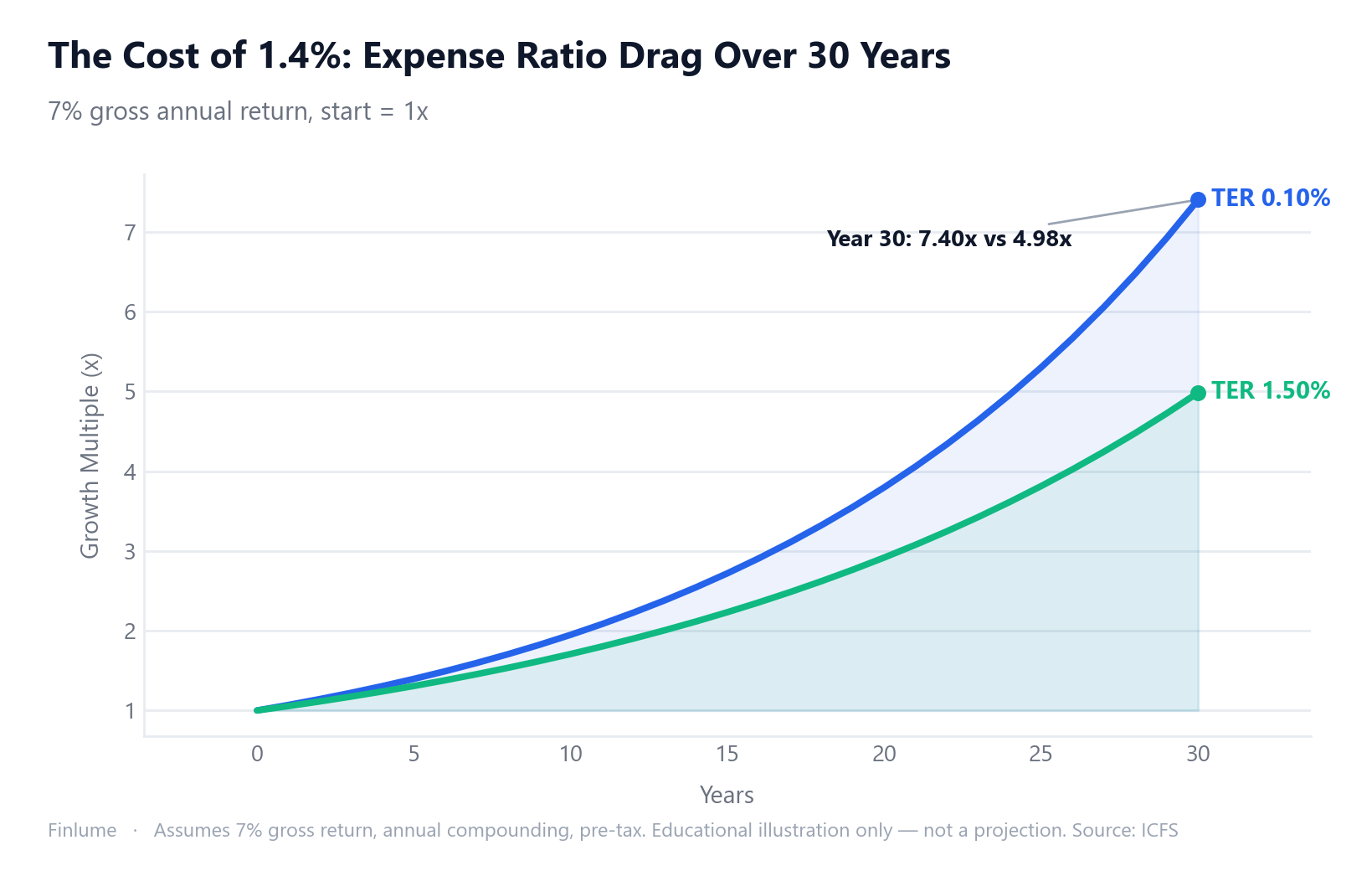
A fee gap isn’t a simple annual deduction. Every dollar lost to fees no longer compounds for you. That’s fee drag — and it accelerates over time because the same percentage skims from an ever-larger base.
Using ICFS calculation data, assuming 7% gross annual return on a $100,000 initial investment:
| Period | Gap: TER 0.1% vs TER 1.0% |
|---|---|
| 10 years | ~$15,800 less |
| 20 years | ~$59,100 less |
| 30 years | ~$165,800 less |
All figures assume 7% gross annual return, annual compounding, no additional contributions, pre-tax. Educational illustration only — not a projection of actual returns.
The first decade looks manageable. The real damage happens between year 20 and year 30, when compounding has built a large base for the fee to work against. At a 10% assumed return the gap is even wider — but 7% is the conservative baseline used throughout this article.
The insidious part: costs are invisible. They don’t appear on a statement as a line item. They quietly shrink the NAV every single day. You only see the impact when you compare the final number to what it could have been.
What 20 Years of Data Actually Shows — SPIVA Evidence
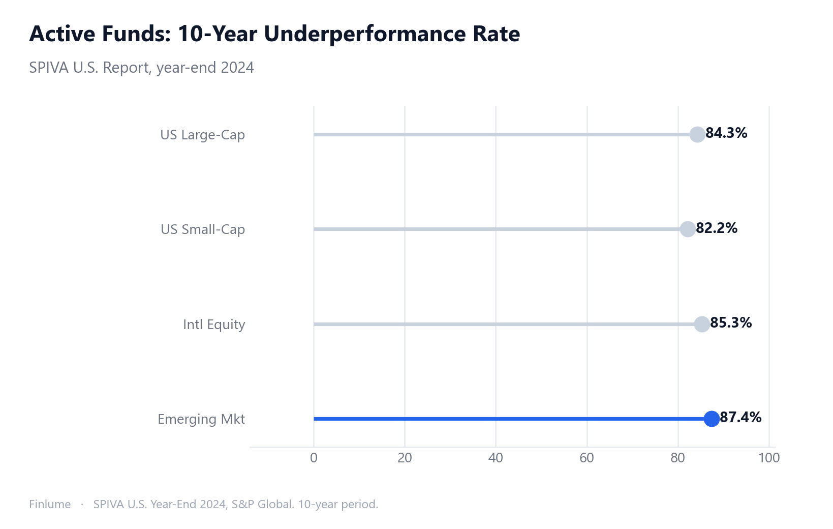
Let’s go straight to the scoreboard. The SPIVA reports use the CRSP Survivor-Bias-Free database, which means closed and merged funds are counted — not just the survivors that happen to be around today.
In 2024, 65.2% of large-cap US active funds underperformed the S&P 500. That’s almost identical to the 24-year historical average of 64%. Looking at 10-year underperformance by category:
| Category | 10-year underperformance rate |
|---|---|
| US large-cap | 84.3% |
| US small-cap | 82.2% |
| International equity | 85.3% |
| Emerging market equity | 87.4% |
Over 15 years (through end of 2024): of 22 US equity categories tracked, the number where active managers as a group outperformed? Zero. Over 20 years (2005–2024): 94.1% of US domestic funds underperformed the S&P 1500 Composite.
Morningstar’s Active/Passive Barometer adds another lens: over 10 years, only 21% of active strategies both survived and beat their passive peer group.
The survivorship bias issue deserves emphasis. Over the same 20-year period, roughly 64% of US domestic equity funds were merged or liquidated. The glossy performance track record in an ad is the record of the funds still standing — the ones that didn’t make it left quietly, their failure statistics erased from the comparison.
A fair caveat on SPIVA methodology: critics point to benchmark selection choices and the pre-tax versus post-tax distinction as legitimate issues. But it remains the most comprehensive, publicly documented dataset available. Use it as a guideline, not gospel.
When Active Can Work — Avoiding Reflexive Passive Thinking
“Always use index funds” is too simple. In markets with higher inefficiency, low-cost active strategies have delivered statistically better outcomes over shorter time horizons.
Emerging market bonds saw a 73.7% one-year active success rate in 2025 (local currency). Diversified emerging market equity funds hit a 64% one-year success rate in 2025 — up sharply from 22% in 2024. US small-cap showed a relatively modest one-year underperformance rate of 29.7% in 2024.
The catch is the long run. That same emerging market equity category drops to a 10-year success rate of just 19.6%. Short-run windows flatter active funds; long-run windows expose cost drag.
The Morningstar data on cost quintiles makes the underlying dynamic clear: the cheapest-cost quintile of active strategies had a 10-year success rate of 27%, versus 15% for the most expensive quintile. Cost predicts success within active management more reliably than manager quality does.
Vanguard’s active funds achieved a 10-year success rate of 44% — more than double the industry average of 21% — largely attributed to their unusually low fees for active products. Low-cost active funds exist; they’re just rare.
Index Funds vs. Active Funds: Side-by-Side
| Factor | Index / Passive | Active |
|---|---|---|
| Management style | Automatic index replication | Manager stock selection |
| Average TER | 0.05–0.20% | 0.42–1.6%+ |
| Transparency | High (index composition is public) | Lower (portfolio changes frequently) |
| Diversification | Full index, automatic | Concentrated by manager conviction |
| Tax efficiency | High (low turnover) | Lower (frequent trading) |
| 20-year market-beating success rate | N/A (index = market) | ~6–21% |
The 20-year flow data tells its own story: passive funds grew +287% from 2016 to 2025, while active funds grew just +62% over the same period. Net flows in 2025 alone were +$95.1 billion into passive, -$18.7 billion out of active (US market).
For deeper context on why low costs matter so much mechanically, how fees erode compounding and ETF expense ratio long-term impact both run the same numbers at 40-year time horizons. If you’re deciding between S&P 500 and total market as your passive foundation, S&P 500 vs. Total US Market compares the two directly.
The Break-Even Math: How Much Alpha Does an Active Fund Actually Need?
The missing piece in most fund comparisons: it’s not enough to know the cost gap. You need to know what consistent annual alpha an active manager must generate — every single year — just to reach the same final wealth as the index fund. The answer is arithmetically exact: the annual alpha needed equals the TER gap. Not roughly. Exactly.
But the compounding effect of failing to clear that bar is non-linear. The table below shows the wealth drag — the percentage of final wealth permanently lost when an active fund carries a given cost gap, assuming the same 7% gross return and no alpha at all (the average scenario across the full active fund universe, since most produce no sustainable alpha).
| Cost gap (active minus index TER) | 10-year wealth drag | 20-year wealth drag | 30-year wealth drag |
|---|---|---|---|
| +0.50% | −4.6% | −9.0% | −13.1% |
| +0.75% | −6.8% | −13.1% | −19.0% |
| +1.00% | −9.0% | −17.1% | −24.6% |
| +1.50% | −13.2% | −24.6% | −34.6% |
Assumptions: 7% gross annual return, index TER 0.10%, annual compounding, no additional contributions, pre-tax. Illustrative arithmetic only — not a forecast.
Now add the probability dimension. Morningstar’s 10-year success rate for active funds is 21%. Suppose you could somehow identify a winning active fund in advance, and that winner produces a generous +1.0% net alpha above the index every year. The other 79% produce no alpha (they pay the 0.75% TER gap as pure drag). The probability-weighted expected outcome across the full active fund selection decision:
- 10 years: expected active wealth = 1.88× vs. index 1.95× (−3.3%)
- 20 years: expected active wealth = 3.57× vs. index 3.80× (−6.1%)
- 30 years: expected active wealth = 6.79× vs. index 7.40× (−8.3%)
Even with an optimistic winner alpha assumption, the expected value of picking an active fund is negative compared to simply buying the index — because the losing 79% drag the average down. The only rational case for paying up is if you have strong, evidence-based conviction that you can identify the minority of consistent winners before they perform — a task that the evidence suggests most professional allocators cannot reliably do.
Key Takeaways — Fund Selection Checklist
Cost is the most reliable predictor of long-run fund success. Twenty years of data consistently points the same direction.
- What is this fund’s TER compared to a passive alternative in the same category?
- When you compound that cost difference over 20–30 years, is the gap something you can justify?
- Is your time horizon 10 years or longer? (Shorter horizons change the calculus somewhat)
- Are you targeting a market with genuine inefficiency — emerging markets, small-cap — where a low-cost active case exists? (Conditional active consideration)
- If you’re looking at a past-performance ad: did that fund even exist 10 years ago? (Survivorship bias self-check)
- If considering active: can you articulate a specific, evidence-based reason you will land in the 21% that outperform — rather than the 79% that don’t? (Break-even reality check)
A perfect fund doesn’t exist. But a fund with a transparent, low cost structure is a better starting point than one with a compelling ad. Check the TER before anything else — that one number compounds in your favor or against you for decades.
Frequently Asked Questions
Do index funds always outperform actively managed funds?
Over long time horizons (10+ years), index funds statistically outperform the majority of active funds — primarily because of lower costs. SPIVA data shows 84.3% of US large-cap active funds underperformed their benchmark over 10 years. However, in certain inefficient markets such as emerging market bonds or small-cap equities, low-cost active strategies can show better short-term results.
Does a 0.1% difference in expense ratio really matter over the long run?
Yes, significantly. A 0.9 percentage point gap (TER 0.1% vs. 1.0%) at a 7% assumed annual return produces roughly a 29% gap in final wealth after 30 years — the index portfolio ends up about 29% larger than the higher-cost active portfolio — due to fee drag, the compounding effect of fees removing capital that can no longer grow. The gap looks modest in the first decade but accelerates sharply between years 20 and 30.
What is survivorship bias, and why does it matter when reading fund performance ads?
Survivorship bias occurs when funds that underperformed and were subsequently merged or liquidated are excluded from performance statistics. Over the most recent 20-year period, roughly 64% of US domestic equity funds were closed or merged. The record shown in fund advertisements reflects only the survivors — the actual success rate across the full original population is substantially lower.
How many active funds actually beat the market over 10 years?
According to the Morningstar Active/Passive Barometer, only 21% of active strategies both survived and outperformed their passive peer group over a 10-year period. The cost quintile breakdown is telling: the cheapest fifth of active funds had a 10-year success rate of 27%, while the most expensive fifth managed only 15%. Cost is a stronger predictor of active fund success than manager skill alone.
Are there any markets where active funds consistently outperform index funds?
Short-term windows show some exceptions. Emerging market bonds posted a 73.7% one-year active success rate in 2025, and diversified emerging market equity funds hit 64% that year. However, extending the horizon to 10 years drops the emerging market equity success rate to just 19.6%. Even in less efficient markets, fee drag eventually dominates over long time frames.
This article is for informational purposes only and is not investment advice. All investment decisions are your own responsibility and carry the risk of loss. Past performance does not guarantee future results.