How Long the S&P 500 Takes to Recover After a Crash: Data From Six Bear Markets
In 94 years of S&P 500 data, not a single major crash has failed to eventually reach a new all-time high. But “eventually” has ranged from five months to twenty-five years. That range is not random — and understanding what drives it is one of the more practical things a long-term investor can carry into the next inevitable drawdown.
The six crashes in this article are the clearest historical case studies available. A few looked like routine corrections at first; others genuinely felt like the end of financial civilization at the time. The data shows how each actually played out — and what the difference in outcomes cost investors who panicked versus those who held.
One caveat before the table: every recovery figure here is price-index only — it measures when the price level returned to its prior peak. Investors who reinvested dividends throughout would have recovered faster in every single case. That distinction matters more than most people realize, and I will return to it.
The Six Crashes: Decline and Recovery Timeline
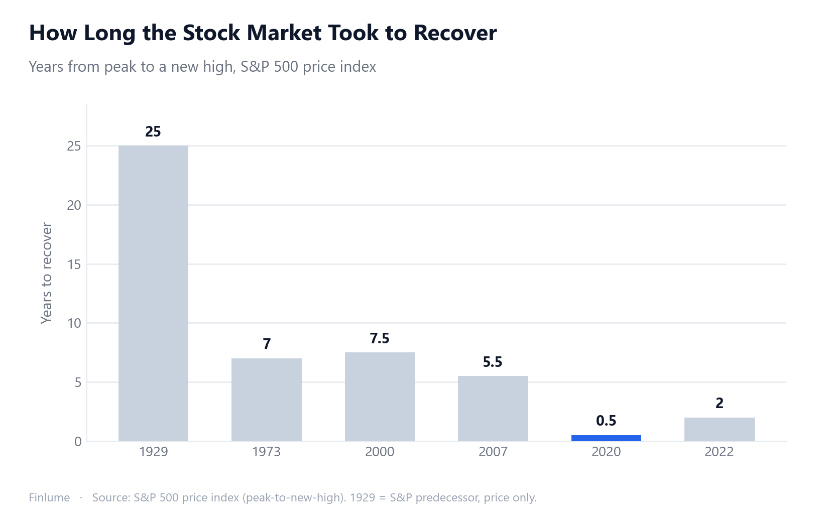
All figures below are for the S&P 500 (or its pre-1957 predecessor index for the 1929 crash) on a price-only basis. “Years to recover” measures the time from the peak to the point where the price index exceeded its prior all-time high.
| Crash | Peak-to-trough decline | Years to new price high |
|---|---|---|
| 1929 Great Depression | about −86% | about 25 years* |
| 1973–74 bear market | about −48% | about 7 years |
| 2000–02 dot-com bust | about −49% | about 7.5 years (March 2000 → Oct 2007) |
| 2007–09 Global Financial Crisis | about −57% | about 5.5 years (Oct 2007 → Apr 2013) |
| 2020 COVID crash | about −34% | about 0.5 year (~5 months; fastest on record) |
| 2022 rate-hike bear | about −25% | about 2 years (early 2022 → ~early 2024) |
Uses the S&P 500’s pre-1957 predecessor index, price-only. The historical extreme outlier.
Sources: Decline percentages and durations from Hartford Funds: Bear Markets. Exact recovery dates for 2000–02 and 2007–09 from Wikipedia: Closing Milestones of the S&P 500.
The Hole You Dig: The Asymmetric Math of Losses
This is the calculation that most crash summaries skip — and it is the one that matters most for understanding why certain recoveries took as long as they did.
Percentage losses are not symmetric. A 50% drop requires a 100% gain just to break even. Each additional point of decline digs a disproportionately deeper hole. The table below shows the minimum gain required from each trough to return to the prior peak, calculated directly from the verified peak-to-trough figures using: break-even = (1 ÷ (1 − |decline|)) − 1.
| Crash | Decline from peak | Gain needed from trough to break even |
|---|---|---|
| 1929 Great Depression | −86% | ~+614% |
| 2007–09 GFC | −57% | ~+133% |
| 2000–02 dot-com | −49% | ~+96% |
| 1973–74 bear | −48% | ~+92% |
| 2020 COVID | −34% | ~+52% |
| 2022 rate-hike | −25% | ~+33% |
Decline figures are approximate (see source table above). Break-even calculated as (1 ÷ (1 − |decline|)) − 1, rounded to nearest whole percent.
The Great Depression needed a +614% gain from the bottom just to reach even. Normal annual equity returns of 7–10% make barely a dent when the target is more than six-fold. That arithmetic alone explains a significant portion of the 25-year recovery timeline.
The 2007–09 GFC needed a +133% gain from the March 2009 trough. The market achieved that in roughly 5.5 years — one of the strongest sustained bull runs in modern history. The 2020 crash needed +52% from its bottom, and it got there in five months on the back of an extraordinary policy response.
I have watched investors make the naive calculation — “it dropped 57%, so when it gains 57% I will be back” — and then be genuinely baffled when they are still far below break-even. The asymmetry is not a subtle nuance. It is the core math of how losses work, and getting it wrong has real consequences for how you plan a recovery.
Depth Does Not Always Predict Duration
The data might suggest a clean rule: bigger drop means longer recovery. That pattern roughly holds across most of the six cases — but 2020 and 2022 break it in a revealing way.
The 2020 COVID crash was the second-deepest drawdown in the modern portion of the table at −34%, yet it recovered in roughly five months — faster than any other major crash on record. The 2022 bear market was the smallest drop in the table at −25%, yet it took about two years — roughly four times longer, from a shallower trough.
The catalyst and the policy response matter at least as much as the size of the drop.
COVID was a sudden external shock with a clear endpoint (vaccines) and an immediate, massive policy backstop — central bank asset purchases, fiscal transfers, rate cuts to near zero. Markets priced in the recovery before the economic data could confirm it. The 2022 bear market was fundamentally different in character: a deliberate, prolonged interest-rate hiking cycle to combat inflation. There was no single “problem solved” moment. Just a slow grinding adjustment that played out over roughly two years. (The recovery date for this cycle carries mild uncertainty; “about two years” is the best available estimate.)
This matters for how you think about the next crash. Asking “how far has it fallen?” is the right first question. But “what caused it, and what would resolve it?” is equally important for estimating how long the fog might last. For a fuller treatment of why trying to call those turning points consistently fails, see why market timing fails in the long run. For background on what defines a bull or bear market in the first place, see bull vs. bear markets explained.
Price-Only vs. Total Return: The Number That Actually Matters
Every timeline in this article uses the price index. It is important to say plainly: total return — with dividends reinvested — tells a more complete story for investors, and it is a more optimistic one.
The dot-com bust: on a price-only basis, the March 2000 peak was not regained until October 2007 — roughly 7.5 years. That is the number most commonly cited. But investors who reinvested every dividend during those years shortened that recovery timeline. By exactly how much is not part of the verified source data here, so I will not quote a specific figure — but the direction is clear and consistent across every crash in the table.
For the Great Depression, the “25 years” figure is real — but it is the price-only floor. Investors in the 1930s–1950s often received dividend yields of 4–6% annually. Reinvesting those throughout the recovery significantly shortened the total-return timeline. Again, I am not quoting an exact number because it was not in the verified source data; I am flagging the direction, because it matters for any honest reading of these figures.
The practical implication: if you hold a total-return index fund or ETF — or if you reinvest dividends manually — the recovery timeline relevant to you is shorter than any number in the table above. Price-only is the conservative upper bound on pain, not the precise figure for a dividend-reinvesting long-term investor.
Recovery Only Rewards Those Who Stay
One thread connects every crash in this table: the recovery benefited only those who stayed invested through it.
The GFC trough was in March 2009. An investor who sold that month — after watching the market fall roughly 57% over 17 months and concluding the worst was still ahead — locked in that loss with no path to recovery. The market did fully recover. It just recovered without them.
The same story played out in every crash here. The five-month COVID snapback rewarded investors who held (or bought) through February–March 2020. The 25-year Great Depression recovery rewarded the uncommon investors who stayed the course — and, more practically, their heirs who were still in the market for the back half of the recovery.
Studying crash recovery data is not primarily about reassurance that everything will be fine. It is about building the factual foundation to hold on when markets are genuinely frightening. The math of recovery is on the side of the long-term investor who stays in — but it only works if you actually stay in. For a deeper look at what the data shows about investors who try to exit and re-enter at the right moment, see why market timing fails in the long run.
Key Takeaways
- Six major S&P 500 crashes took between ~5 months and ~25 years to recover on a price-only basis — a range driven by both drop depth and the nature of the catalyst.
- All figures here are price-index only; total return (dividends reinvested) shortens every recovery timeline.
- The 1929 Great Depression (−86%) is the extreme outlier and uses the pre-1957 predecessor index.
- The 2020 COVID crash (−34%) holds the record for fastest modern recovery at ~5 months.
- The 2007–09 GFC (−57%) is the deepest modern crash; it recovered in ~5.5 years.
- The asymmetric math is real: a −57% decline needs ~+133% to break even — not +57%.
- Drop depth alone does not predict recovery time: 2020 recovered faster than the milder 2022 bear because the catalyst and policy response were different.
- Recovery only rewards investors who stay invested through the downturn; selling near the bottom locks in the loss permanently.
Frequently Asked Questions
What was the longest S&P 500 crash recovery in history?
The 1929 Great Depression. The pre-1957 predecessor index fell about 86% peak-to-trough, and it took roughly 25 years to reach a new high on a price-only basis. This is the extreme historical outlier — no modern crash comes close.
What was the fastest S&P 500 recovery from a major crash?
The 2020 COVID crash, which recovered in roughly 5 months — the fastest major-crash recovery on record. Despite a roughly 34% decline over about 33 days, an unprecedented policy response drove a swift rebound.
Do these recovery timelines include dividends?
No — all figures are price-index only, measuring when the price level returned to its prior peak. With dividends reinvested (total return), recovery is faster in every case. Exact total-return dates are not included here because they were not part of the verified source data; the key point is that dividend reinvestment meaningfully shortens every timeline.
Why did the milder 2022 bear market take longer to recover than the worse 2020 crash?
The catalyst and policy response matter at least as much as the size of the drop. COVID was a sudden shock with a clear policy resolution. The 2022 bear market was driven by a prolonged interest-rate hiking cycle that unfolded gradually. A -25% loss tied to a sustained tightening cycle can linger longer than a sharper -34% shock that ends quickly.
Does historical S&P 500 recovery guarantee the market will always recover?
No. These are historical data points for a broad, diversified U.S. equity index. Past performance does not guarantee future results. Individual stocks can go to zero. The pattern shown here reflects the U.S. market as a whole — it is not a promise for any single stock, sector, or another country’s market.
What is the practical takeaway for a long-term index investor?
Every recovery in this table only benefited investors who stayed invested through the downturn. Selling near the trough locks in the loss permanently. The subsequent rebound — whether it took 5 months or 5.5 years — rewarded only those who held on.